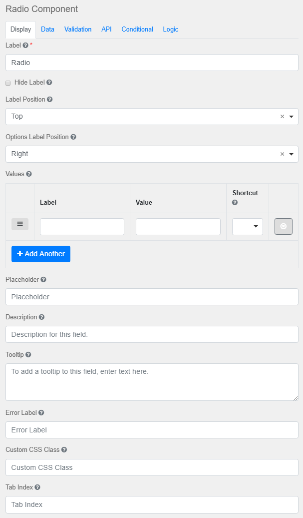
Label
The name or title for this component.
Hide Label
Hide the label of this component. This setting will display the label in the form builder, but hide the label when the form is rendered.
Label Position
Position for the label for this field.
Options Label Position
Positions for the label for options for this field.
Values
Add values to the select boxes for users to choose from.
Placeholder
The placeholder text that will appear when this field is empty.
Description
The Description is text that will appear below the input field.
Tooltip
Adds a tooltip icon to the side of this field.
Error Label
The label that will display for the field when a validation error message is shown.
Custom CSS Class
A custom CSS class to add to this component. Multiple class names can be added, separated by a space.
Tab Index
Sets the tabindex attribute of this component to override the tab order of the form.
Multiple Values
If checked, multiple values can be added in this field. The values will appear as an array in the API and an “Add Another” button will be visible on the field allowing the creation of additional fields for this component.
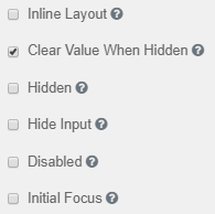
Inline Layout
Displays the checkboxes/radio-boxes horizontally.
Clear Value when Hidden
Clears the value when the field is hidden
Hidden
Remains part of the form but is hidden from view.
Hide Input
Hides the input in the browser.
Disabled
Disables the form input.
Initial Focus
The field becomes the initially focused field on the form.
|


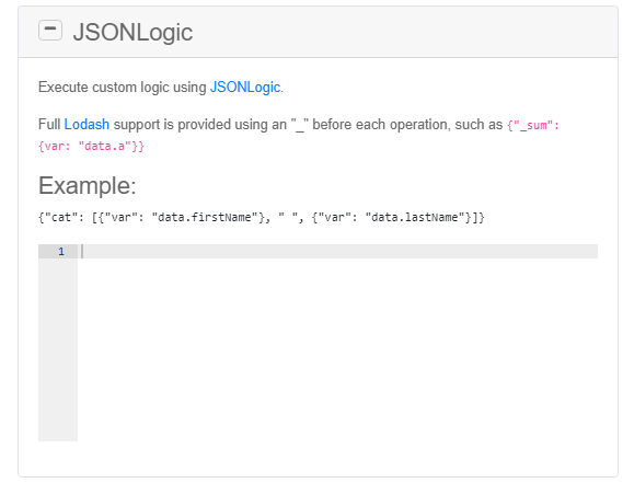
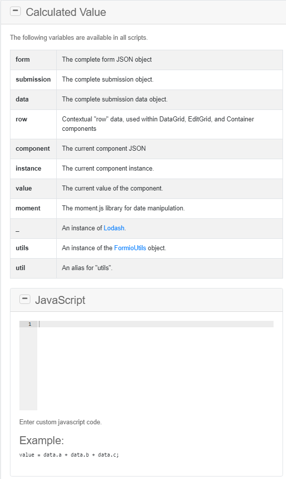
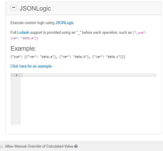
