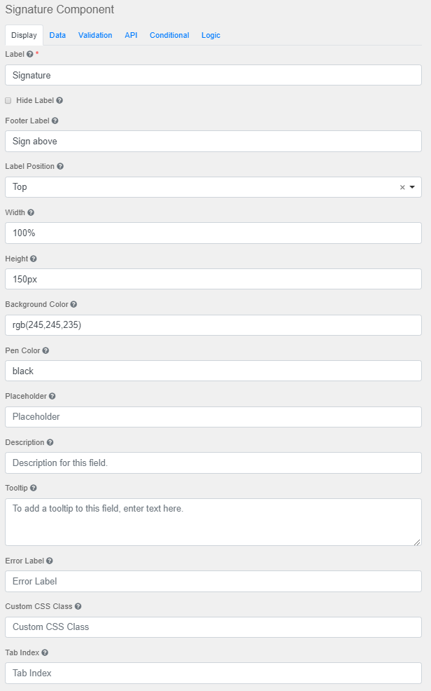
Label
The name or title for this component.
Hide Label
Hide the label of this component. This setting will display the label in the form builder, but hide the label when the form is rendered.
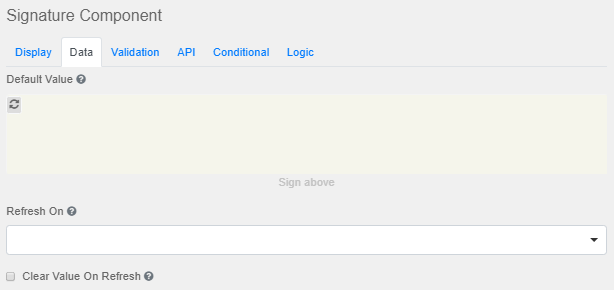
Footer Label
The footer text that appears below the signature.
Label Position
Position for the label for this field.
Width
The width of the signature area.
Height
The height of the signature area.
Background Color
The background area of the signature area.
Pen Color
The ink color for the signature area.
Placeholder
The placeholder text that will appear when this field is empty.
Description
The Description is text that will appear below the input field.
Tooltip
Adds a tooltip icon to the side of this field.
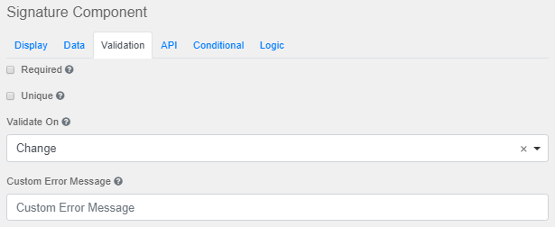
Error Label
The label that will display for the field when a validation error message is shown.
Custom CSS Class
A custom CSS class to add to this component. Multiple class names can be added, separated by a space.
Tab Index
Sets the tabindex attribute of this component to override the tab order of the form.
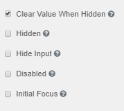
Clear Value When Hidden
Clears value when hidden.
Hidden
Remains part of the form but is hidden from view.
Hide Input
Hides the input in the browser.
Disabled
Disables the form input.
Initial Focus
The field becomes the initially focused field on the form.
|


